|
|
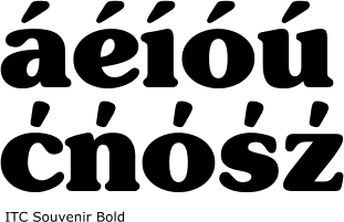
You might have heard that the acute accent is used
in Polish language. Wrong! The Polish kreska in a 8 point face
seems similar to acute but if you look closer, you'll discover that a
Polish kreska, when designed according to the requirements of Polish typography,
is differently shaped and placed than the usual acute.
The Polish accent is mostly known as kreska or kreseczka,
yet having no "official" name. The word kreska means
stroke. Kreseczka is a diminutive, meaning little stroke.
|

|
|
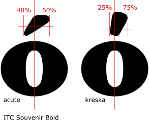
The Polish kreska runs steeper and is shifted more to the
right rather than centered above the base glyph. The middle of its "impact"
resides lower than that of the acute.
|

|
|
The obvious problem visible here is the problem of two glyphs
for the same character. The Unicode standard and all other encoding tables
usually identify the Polish accents as acutes, there's cacute, nacute,
sacute, zacute and -- of course -- oacute. While the designer
might try to draw the accent above the Polish soft consonants differently
(as these characters don't appear in other languages), he still has to
cope with the problem: where to put the "Western" oacute and
the "Polish" oacute.
|
|
Currently, neither the Type 1 nor the TrueType font technology
give a solution. No matter if the font is fully Unicode-encoded or if
it contains only the characters of the Central European codepage (Latin-2),
there is still a conflict between the two acutes.
|
|
Fortunately, the OpenType font format allows language-sensitive
glyph substitution. The designer will be able to create alternative variants
of the oacute character and to substitute the one with a steeper accent
when the text is typeset in Polish.
|
|
Kreska over capital letters may run flatter, thus looking
more similarily to the acute accent, especially in text typefaces.
Some existing typeface designs require no changes at all
or just cosmetic changes.
|

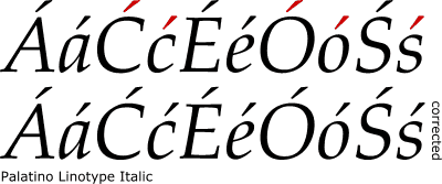
Hermann Zapf's Palatino Linotype, where you can see that
the roman style suits the Polish language perfectly.

Nevertheless, the kreska in the Italic style of Palatino
Linotype must have been respositioned (slightly shifted to the right).
|
|
On the contrary, other designs require larger corrections
-- the existing shapes of Polish diacritics are very questionable.
|

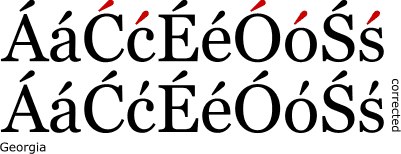
In Matthew Carter's Georgia the kreskas must have been repositioned.
Additionally, the lowercase kreska must have been redesigned (rotated,
then shortened).
|
|
The kreska in sans-serif typefaces may also differ significantly
from acute.
|

The difference between the found (acute) and the intended
(kreska) may be huge
|
|
It is obvious that the accents should follow the thick-thin
proportions of base letters. It may be particularily difficult in typefaces
with a short ascent.
|

Even a short descent should prevent the kreska from stiking rather upright.
The thickness proportions are very imporant here. Note that there's still
a normal acute above a, but a kreska above c, o and s.

|
|
Although both reside in the same codepage, the Czech čarka
and Polish kreska are two fully different things. The Czech čarka
is used for marking long vowels ans is placed only above vowels. The Polish
kreska is generally used for marking soft consonants. The only exception
is the Polish "o z kreską" (ó) which expresses a "oo"
vowel. In the history, the kreskas above the consonants looked differently
than the kreska above the o, but then the majority of "consonant
kreskas" "overhelmed" the "vowel kreska". The
difference may be well seen when uppercase handwiritng of contemporary
Czech and Polish are compared (here simulated).
|

|
