
|
|
|
|
Ogonek is probably one of the most misunderstood and misshaped character elements ever. It all starts with the essentially wrong assumption that ogonek is an accent. No, it's not. It's much more a character element, just like a stem, a serif or a descent. In a vast majority of cases ogonek should be smoothly connected with the base glyph, it should be a part of the glyph. Ogonek is used in Polish and Lithuanian. A similar shape can be also found in the Navajo and Tuchtone languages. It should be noted that the Polish and Lithuanian traditions in drawing the ogonek differ. Again, OpenType language-sensitive glyph substitution would be a good solution here. The word ogonek is a Polish diminutive. It means little tail or the stem of an apple. |
|
|
Unfortunately, this is not the case in many fonts. |
|
|
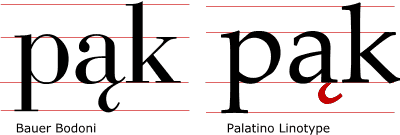
Ogonek should be a significant element of the letter. In most cases in should reach the descent line. |
Bauer Bodoni (as shown here) has a properly sized, easy-to-decode ogonek. The ogonek in Palatino Linotype is too short, too thin and badly shaped (it exceeds the right boundary of the base character). |
|
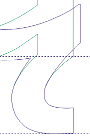
The width-height proportions of the ogonek should match the proportions of the lowercase glyph (marked blue). Also the relationship between the thick and thin elements of the letter should be preserved (marked green). |
|
|
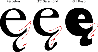
Most typefaces mimic calligraphy. It is usually very helpful to draw the ogonek trying to imitate the original calligraphic technique which was used to draw the original typeface. |
|
|
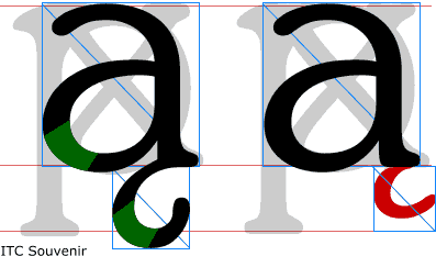
The ogonek should never exceed the right boundary of the basic glyph. It makes the letter loose its natural harmony and balance and thus "flip" to the right. |
Ogonek should never exceed the width of the basic glyph |
|
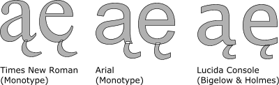
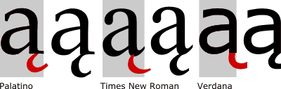
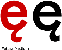
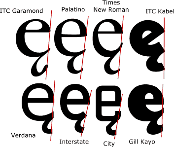
When ogonek is merged with lowercase e in order to create eogonek, please note that it should not be attached centrally like cedilla. It should be placed near the right boundaryof e (but should not exceed it). When merging ogonek with lowercase e, it is often a good method to draw a line joining the rightmost points of the letter e. Going along the line you should find a the point where ogonek should end. |
|
|
Note that you will be rarely able to use exactly the same shape of ogonek for all letters. As ogonek is a glyph modifier and it should be integrated smoothly, you will be usually forced to separately design the area where ogonek merges with all base letters. |
|
|
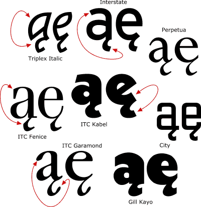
You should also try to use existing typeface elements to draw/construct the ogonek. As you can see here, ogoneks used in Triplex Italic different significantly, but they still preserve the mood of the original typeface. Interstate's descenders (like g) run very open, soe does ogonek. City has a very rectandular shape, with many straight angles, so you may try to implement such angle in the ogonek, too. It is a kind of modern "broken letter" writing style. |
|
|
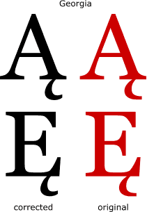
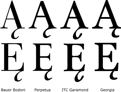
Uppercase letters with ogonek are easier to create than lowercases, bacause the ogonek is always attached to a flat base (except tha uppercase Uogonek which . Nevertheless, there are in fact only very few typefaces produced in the Western world which contain correct ogoneks. Even relatively nice attempts like Matthew Carter's Georgia should be corrected. Most of the popular typefaces containing Polish diacritics is plainly wrong. It's a pity, particularily that these are often the only patterns and sources for foreigners |
|
|
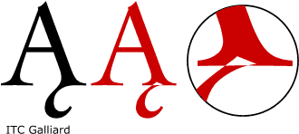
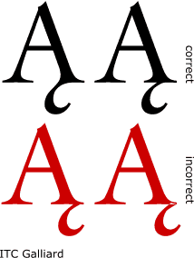
There are two correct ways of attaching ogonek to the base serif of capital A. The attaching point can be either placed in the centre of the stem or may be merged with the inner part of the base serif. Attaching ogonek to the outer part of the base serif are very incorrect! Merging the ogonek with the inner part of the base serif is more difficult but the result is usually more spectacular. You could call this unorthodox style. Note that the ogonek should grow directly from the stem and not from the serif. Attaching the ogonek in the centre of the stem is more "safe" and traditional. |
|
|
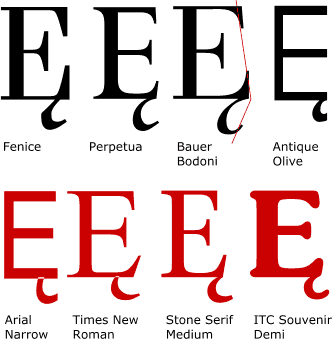
When attaching the ogonek to the capital E, you should follow the same rules as with small e. The ogonek should end at the visual edge of the letter and vener go beyond it. If the upper part of E is shorter than the lower part, the ogonek may be attached a bit to the left, to create a kind of visual symmetry. |
|
|
Obviously the ogonek should match the typestyle in shape and weight. It should always be the same as in the lowercase. |
|
|
|
|
[Introduction] [Kropka] [Kreska] [Ogonek] [Stroke]